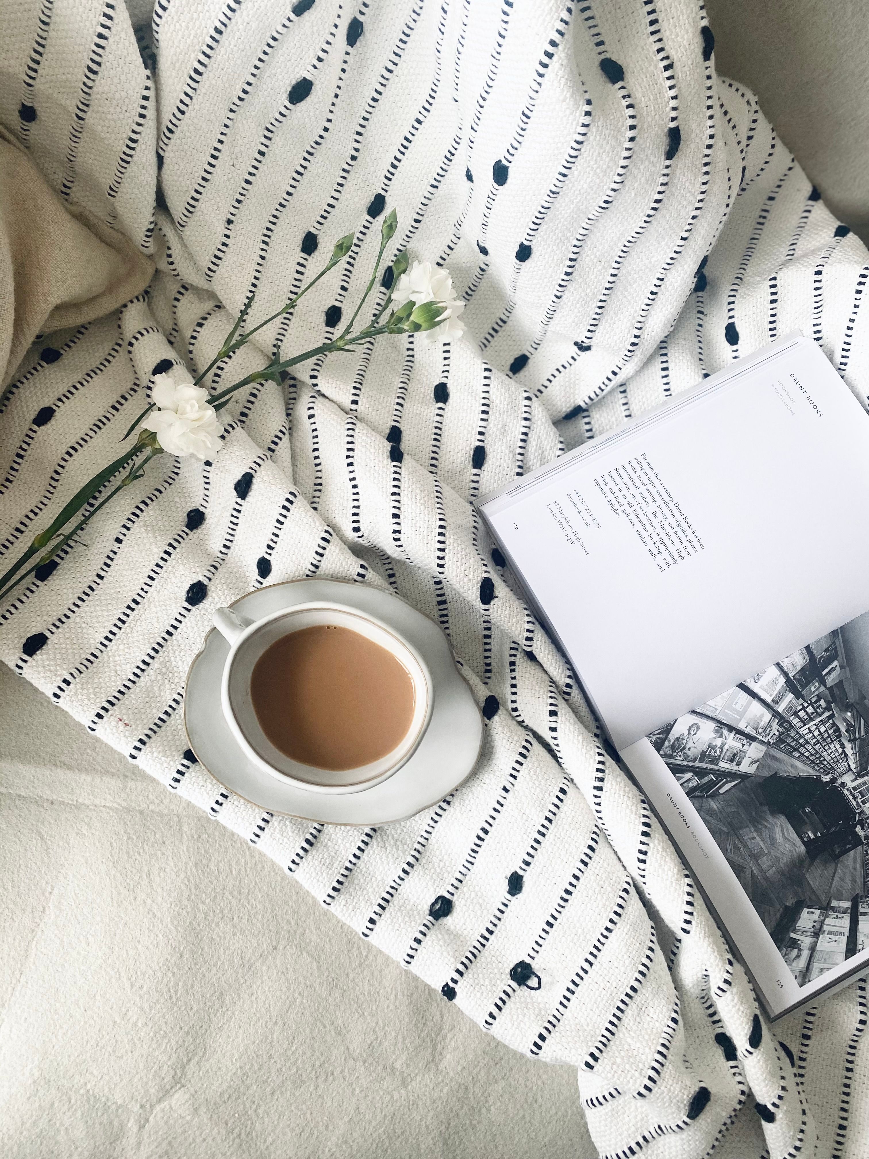
Why I Created This Food Blog
My kitchen has always been my happy place. For years, I collected scattered recipe notes, hosted crowded dinner parties, and took endless photos of my plates. My friends constantly asked for my recipes, which usually resulted in me texting messy, unstructured instructions.I realized I needed a central hub. I wanted a beautiful, organized space to archive my culinary experiments and connect with fellow food lovers. This website was born out of a desire to make home cooking approachable, inspiring, and visually mouth-watering for everyone.
How I Built the Website
- Creating a modern, visually appealing website does not require complex frameworks. By focusing on clean aesthetics and utilizing core CSS features, I built a minimalist layout that is both functional and engaging. Here is a breakdown of the key design elements and CSS techniques I used to bring this project to life.
- To achieve a balanced and responsive structure, I relied heavily on CSS Flexbox. Instead of fighting with floats or positioning, Flexbox allowed me to align content effortlessly.Navigation and Grid: I used display: flex to create a clean navigation bar and space out layout sections evenly.Alignment: Utilizing justify-content: space-between and align-items: center ensured that the elements remain perfectly aligned on all screen sizes, maintaining a consistent grid without visual clutter.
- Minimalism thrives on whitespace and structure. I utilized the standard CSS Box Model to define clear, distinct content areas.Padding and Margins: Generous padding inside the cards gives the text room to breathe, which enhances readability.Sizing: I used box-sizing: border-box to ensure that padding and borders do not alter the intended width of my elements, keeping the overall layout predictable and sharp. my cooking style.
- Links are the core of web navigation, but they also serve as design elements. In this layout, I kept typography simple and clean.
- To make the minimalist design feel alive and responsive, I added subtle :hover states to interactive elements.Buttons and Cards: When a user hovers over a link or a content box, the background color shifts slightly, or the element lifts with a gentle transform effect.Smooth Transitions: By pairing these hover states with the transition property, the visual changes occur smoothly over a few milliseconds, providing a premium, tactile feel.
- To add a layer of sophistication, I implemented an overlay effect on media elements.The Setup: Using a relative container, I placed an absolute-positioned overlay div directly on top of the images.The Effect: Initially semi-transparent or hidden, the overlay reveals text, icons, or a color tint upon hover. This technique adds depth to the minimalist aesthetic and keeps additional information hidden until it is relevant to the use
-
Conclusion
By combining Flexbox, the Box Model, interactive links, hover animations, and elegant overlays, I created a website that proves less is truly more. This project demonstrates how fundamental CSS properties can be leveraged to build a fast, responsive, and sophisticated user experience.